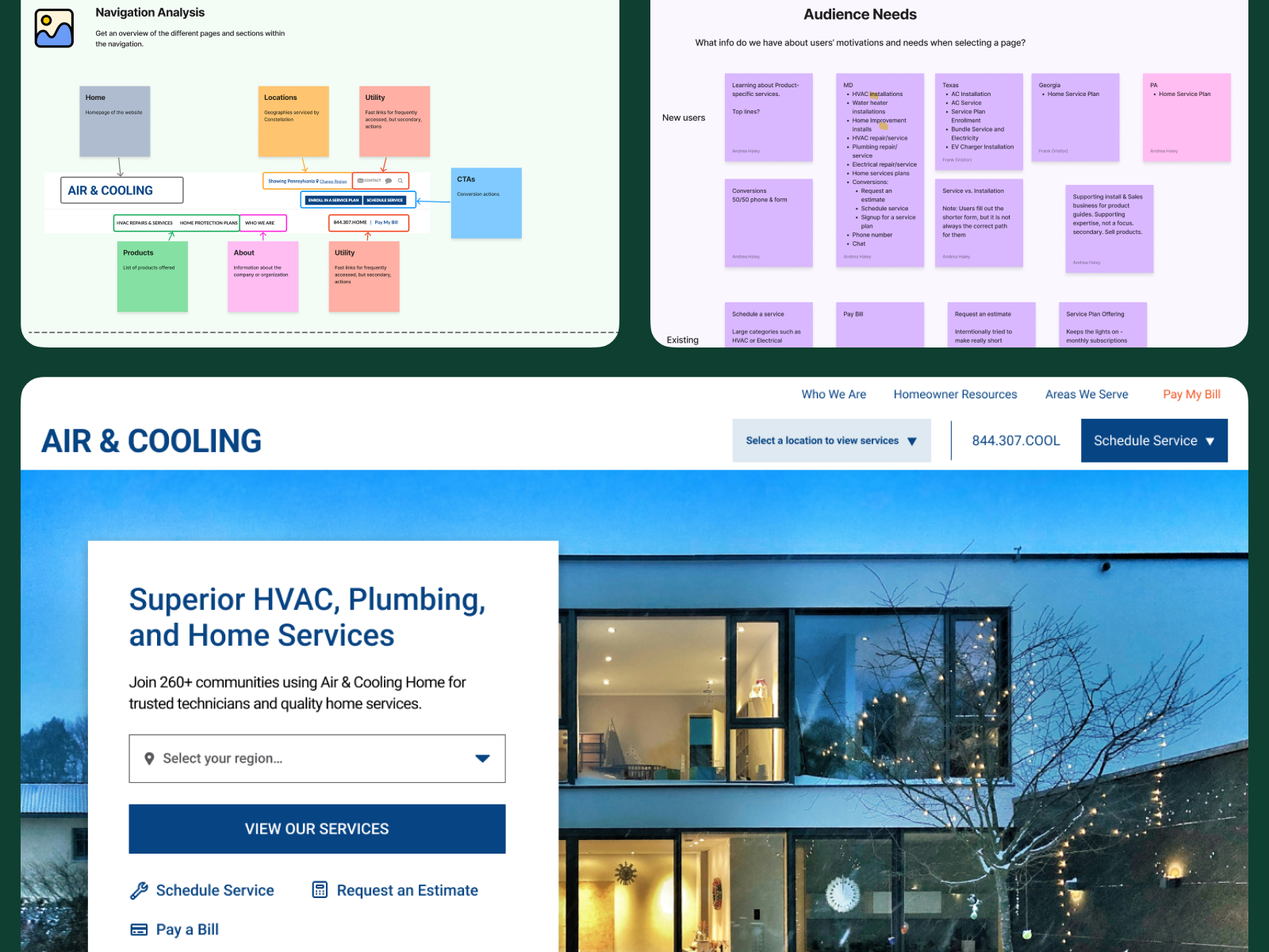
Navigation Updates for Consistency and Scalability Across States
Services vary across Constellation Home’s locations, and users struggled to find relevant HVAC offerings. As the company planned to expand, it needed more straightforward and consistent navigation to route users to pertinent services.
Project Scope
Ideation, discovery, information architecture, product navigation
Team
Product Marketing Manager
Timeline
1 month
Industry
B2C Home Services
My Role
UX Lead
Project Overview
Constellation Home, a home HVAC services company with operations across multiple states faced significant challenges with its website navigation. Each state had a different navigation structure, leading to inconsistent labels and unclear service offerings. This lack of uniformity frustrated users, causing confusion and drop-offs in the user journey. The company needed a scalable solution to streamline its digital presence while accommodating state-specific nuances in service offerings.
Problem
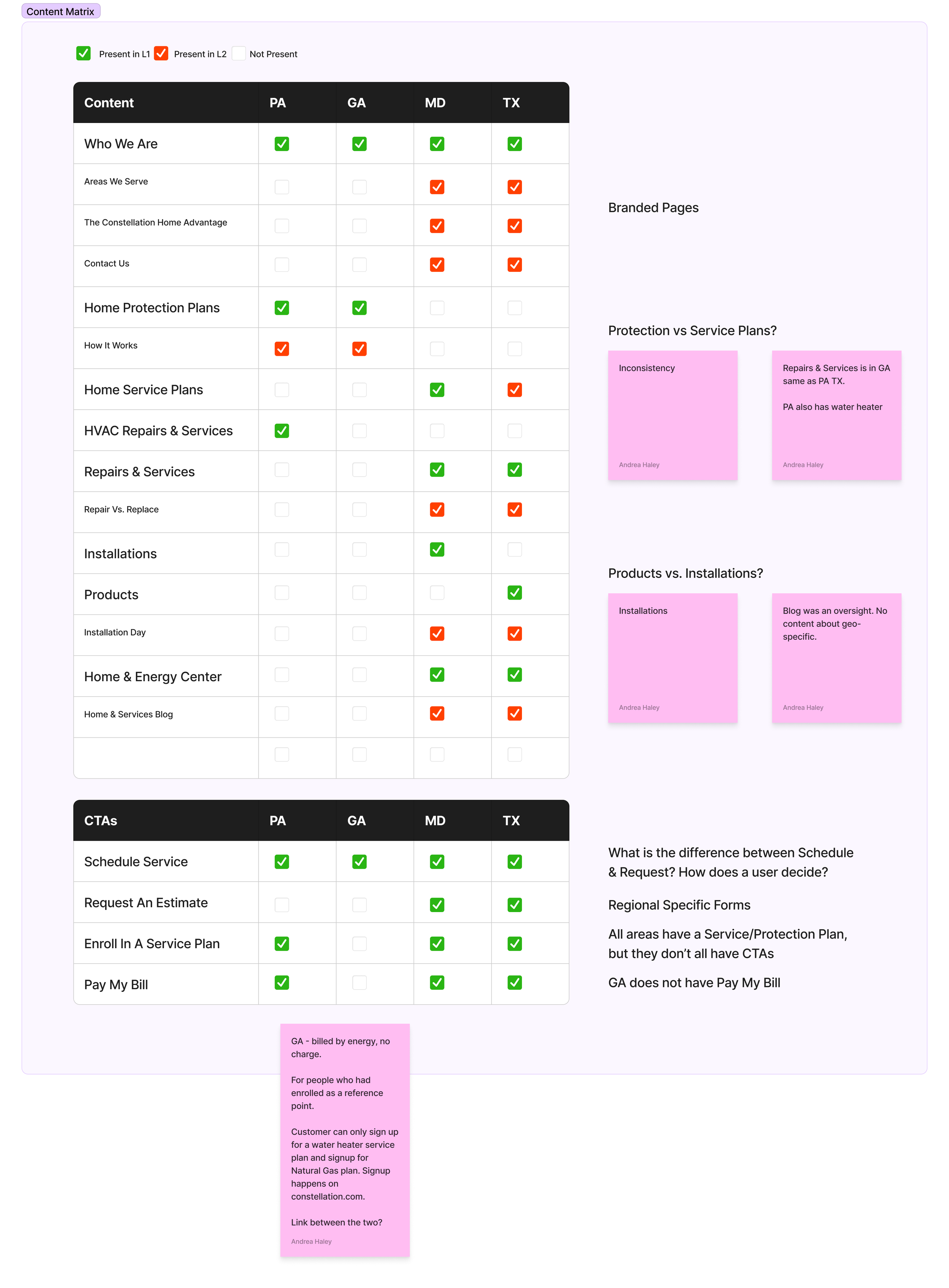
Inconsistent Navigation: The navigation structure varied for each state, leading to user confusion and difficulty in finding relevant services.
Unclear Service Offerings: Labels were inconsistent, and product services were not displayed clearly, which impacted the users' ability to understand the range of services provided.
Lack of Scalability: The navigation system was not designed to scale with the company’s growth, causing further friction as the company expanded.
Research & Insights: I initiated a comprehensive research phase to understand both the user pain points and industry best practices:
Audit and Content Inventory: By creating a comprehensive inventory I uncovered that users struggled to navigate the site and often abandoned their search for services due to confusing labels.
Competitive Analysis: I benchmarked against competitors in the HVAC industry and broader service industries, analyzing how they managed product offerings across different locations.
Stakeholder Interviews: I educated stakeholders on the importance of consistency, scalability, and progressive disclosure in navigation systems, emphasizing the user’s need for a predictable and intuitive journey.
Strategy: Based on the research, I formulated a UX strategy that focused on:
Consistent Navigation Framework: Standardizing the navigation system across all states while allowing flexibility for state-specific nuances.
Progressive Disclosure: Using a layered approach to navigation, I ensured that users were not overwhelmed by options but could still access detailed information as needed.
Clear Labeling: Developing a consistent taxonomy for product and service labels to reduce confusion and improve discoverability.
Design & Implementation: After securing stakeholder buy-in, I led the UI design phase to create a scalable, user-centered interface and worked through many iterations of the homepage to achieve:
Scalable Navigation: I designed a navigation system that worked consistently across states but allowed for customization where necessary, ensuring a seamless user experience.
Responsive Design: The UI was optimized for various devices, ensuring that users had a smooth experience whether on desktop or mobile.
Visual Hierarchy: Clear visual cues and a simplified structure made it easy for users to understand the company’s offerings without feeling overwhelmed.
Low fidelity, rapid navigation iterations
Results:
Clarity: The new product groupings allow users to identify the services available in their area quickly. Moving from hiding all the services within a single dropdown menu to a category-driven navigation with “Heating,” “Cooling,” “Electrical,” etc., allows users to self-select and understand if Air & Cooling can fit their needs.
Consistency: Each state’s navigation now follows a predictable, easy-to-maintain pattern and uses the same labels. Instead of label inconsistency, such as “Protection Plans” vs. “Service Plans,” there is now a clear plan for better education and copywriting. SEO-friendly content that attracts top-funnel users can also use this label to explain the ongoing services available to users better.
Scalability: The new system allowed the company to expand into new states without further structural changes. As cities and states are added to Air & Cooling’s website, there is a plan to adjust for searching by zip code, showcasing city-level regions, and moving away from whole state pages.
Conclusion: The redesign of the HVAC company’s website demonstrated the importance of consistent, scalable navigation, especially for companies with region-specific nuances. By aligning the user experience with best practices and educating stakeholders on key UX principles, I delivered a user-friendly, efficient digital experience that aligns with how users look for service and enables business growth through consistency and scalability.


